Semantic Tokens for Color, Order for 600+ Icons
Building DEX's color foundation from scratch and replacing years of bespoke icon production with a governed system built upon Google Material
GE Vernova | UX interaction designer | 2017-Present
The Problem

A sample of bespoke GEDI icons with no Material Design equivalent, identified as gaps in the move to DEX. Icons are named where the source audit labeled them and numbered where names are still to be assigned.

Colors defined in the UX team's UI toolkit as well as its legacy documentation were not implemented correctly or consistently by adopting module teams. This made QA an impossible hurdle, but it also meant there was not a central hub that could provide widespread updates.
My Role
I led both systems as one connected effort, not two separate projects.
For color: I defined what the tokens needed to mean and how they'd fit into DEX, working closely with a design technologist who handled the technical build.
For icons: I owned it end to end: the decision to retire Predix and GEDI, the migration, the 149 custom icons Material couldn't cover, and the guidelines that govern the library today. I wrote all the documentation for both, published in Confluence.
What I Did and Why
Built shared foundations instead of patching individual problems
For color: a base palette feeds 163 semantic variables across nine categories — Surface, Border, Text, Icon, Interaction, Feedback, Workflow, Data Visualization, Markers. Base colors never touch a component directly; only the semantic layer does.

Before creating semantic color assignments, I did a color audit on our current library to track the foreground and background combinations that were an accessibility risk. This helped me understand what colors had to be kept.

Where every token starts: the raw color scale before it becomes meaning. This document provided paths for semantic color assignments and expansion of color themes because not all of these base colors are used in DEX. The benefit: If we have to add more shades / more tokens, they're predetermined – no invention required.
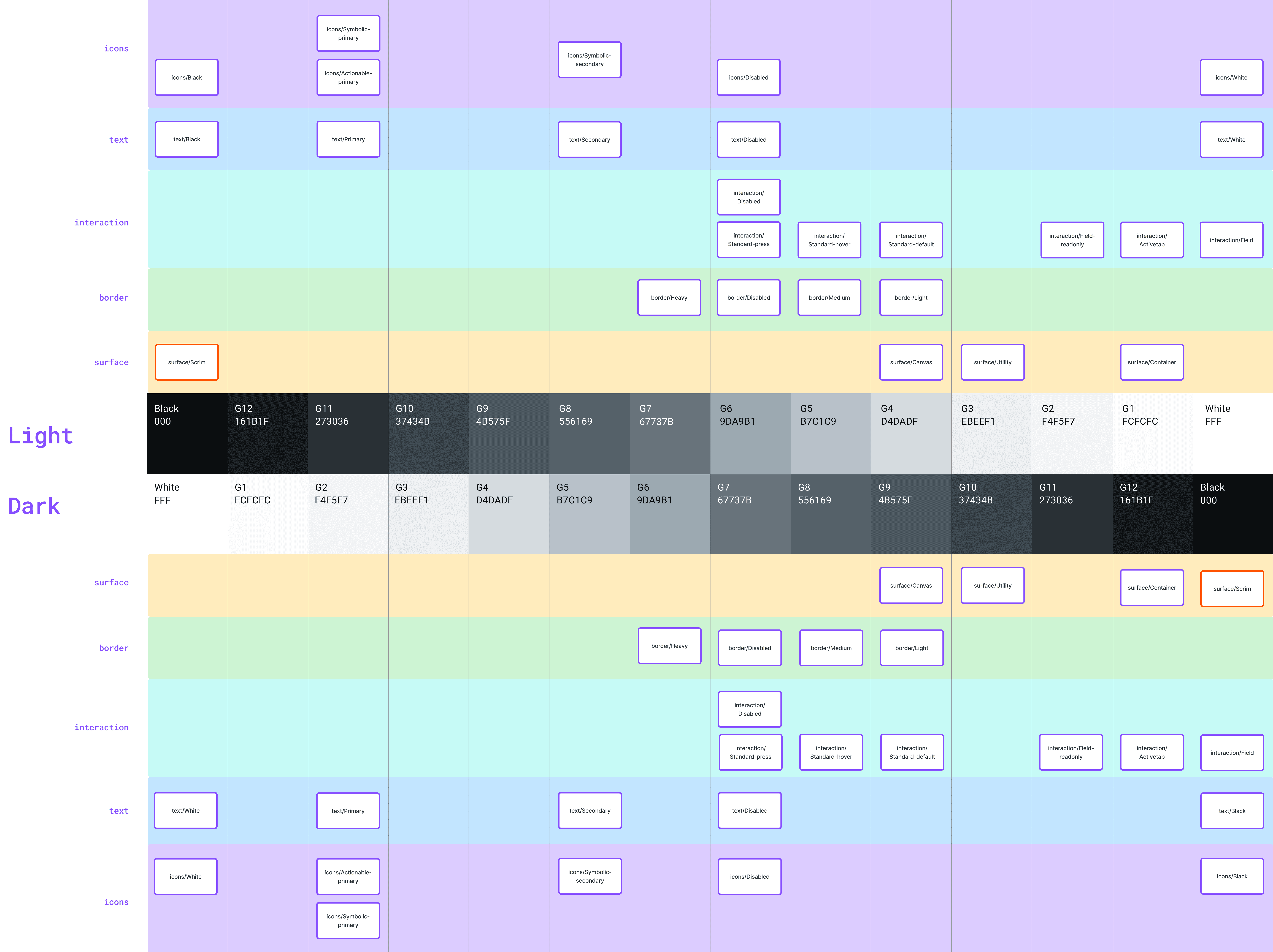
Color assignments for each token were based on using the grays as a foundation because they're generally used as surface, text, and icon colors. By reversing white-through-black in the center of the document, I created vertical lanes where I could assign tokens. With the exception of our scrim color, always black, the result is a reflecting pool where light and dark values are in the same lane on either side of the horizon. I didn't know this would be the result, but the symmetry indicates a solid foundation for light/dark theming.
For icons: I mapped all 600+ existing icons to Google Material before retiring anything, then designed 149 custom icons for the gaps Material didn't cover, matching its grid and stroke weight closely enough that you can't tell which icons are custom. Both replace team-by-team guesswork with one shared foundation.
I also dropped GEDI's dual SVG and font option for SVG only and I handed repository responsibilities back to engineers so the library doesn't need a UX resource for every request.

In addition to the icon production work, I documented the contribution process, wrote the guidance working with icons in Figma, and created the "How To" for creating custom icons to match Material.


Variables for icon color, each with a specific semantic purpose. With this enabled, component design happens once instead of twice for a dark variant.
Designed the full semantic taxonomy for APM's real needs
The token system covers far more than basic UI categories. Working from APM's (GE Vernova's Asset Performance Management software) actual product requirements, I defined 163 semantic variables across categories covering Surface, Border, Text, Icon, Interaction, Feedback, Workflow, Data Visualization, and Markers – glyphs for data grids and visualizations.
The Data Visualization category spans 12 distinct color families – Red, Blue, Forest Green, Orange, Yellow, Violet, Magenta, Evergreen, Ultramarine, Lime, Cyan, and Gray – each with five stepped values (100–500) calibrated for legibility in both themes.
The Workflow category maps 11 distinct asset states – New, Draft, Submitted, Reviewing, Evaluating, In-Progress, Complete, Approved, Rejected, Neutral, and Neutral ALT – a taxonomy for statuses that you really only understand with deep knowledge of how APM's users track and manage their work.
The Markers category – 27 tokens across 9 color families plus White, Gray, and Black – carries a specific architectural distinction: marker values are theme-invariant. Unlike every other token in the system, markers hold the same value in both light and dark mode. This was a deliberate decision. Markers are used to identify and distinguish data points in charts and maps where color carries fixed categorical meaning for users with normal vision. Inverting them across themes would break that meaning. The system knows the difference between colors that adapt to context and colors that must stay constant.


Variables for data visualizations in Figma.

Variables for the workflow color palette, built in Figma.

Marker color variables in Figma.
Made the rules enforceable, not just written down
For color, I ran an automated contrast grid testing every foreground token against every background token for WCAG AA and AAA — a full audit, not a spot check, and one I can re-run as the system grows. For icons, the contribution guidelines have teeth: nonconforming icons get flagged and removed, and outside sources like FontAwesome and IcoMoon are banned outright. A guideline nobody enforces is just a suggestion.
The Scope
163 color variables across nine categories, including a 12-family data visualization palette and a 27-token marker system that holds steady across both themes. A 600+ icon library built on Google Material, extended with 149 custom icons, organized into 24 categories. Full documentation for both systems in Confluence. Every color token meets WCAG 2.2 AA at minimum, verified against an automated contrast grid. 50% less design workload for the UX team. The first icon library in the company's history with consistent adoption.
Where It Stands
Both systems are live and shipping as part of DEX. The token architecture – full light/dark support, WCAG compliance, full documentation – extends to every product built on DEX going forward. Dark mode itself hasn't shipped in APM yet; the org has been slow to commit to it. But the tokens are already built for it, so when that switch finally flips, the work is done. The icon library is in use across product teams; I export the SVGs and engineers handle the rest. Neither system needs me to keep running, which was the goal. Every team that adopts DEX gets both foundations out-of-the-box.
