Trained at the Source
Where the systems thinking behind GE Vernova's DEX, sticker sheets, and icon governance was first learned.
EightShapes | Senior Visual designer | 2012-2015
The Problem
When I joined EightShapes, design systems weren't a named discipline yet. There was no playbook, no shared vocabulary, no standard training; a handful of consultancies were inventing the practice in real time, EightShapes among them. Nathan Curtis had already written the book on it, literally: Modular Web Design, published in 2009, four years before Brad Frost coined "Atomic Design" in 2013. Nathan Curtis and Dan Brown ran the design agency, and through the work itself, we kept arriving at the same conclusion: design held up better when it was modular and systematic instead of bespoke and one-off. Learning that meant working the actual problems shaping the discipline, across clients with nothing in common except one need: make a decision once, reuse it everywhere.
My Role
Senior Visual Designer. Over three years, I worked dozens of client engagements, including Yahoo! and 3M, but three taught me the most about systems thinking: Marriott, Cisco, and Sonatype. The vocabulary came later. We were building the muscle for it.
What I Did… and Why
Learned modularity on Marriott's reservation path
I helped build a modular component library for Marriott's first responsive design system, running workshops with their designers and developers. The clearest example was a branded map pin system – every Marriott brand (Ritz-Carlton, JW Marriott, AC Hotels, Courtyard, Fairfield, Autograph Collection, and more) needed its own pin, with the same states: default, hover, numbered, abbreviated. We designed across four breakpoints at once, on a reservation path where a single day's 1% conversion loss was a real business problem. That's where I learned modular components aren't a style choice, they're what makes a system trustworthy enough to bet revenue on.

One pin system. Nine-plus brands. Same default, hover, numbered, and abbreviated states.


Map pin system: iterations 2, 3, and 4.

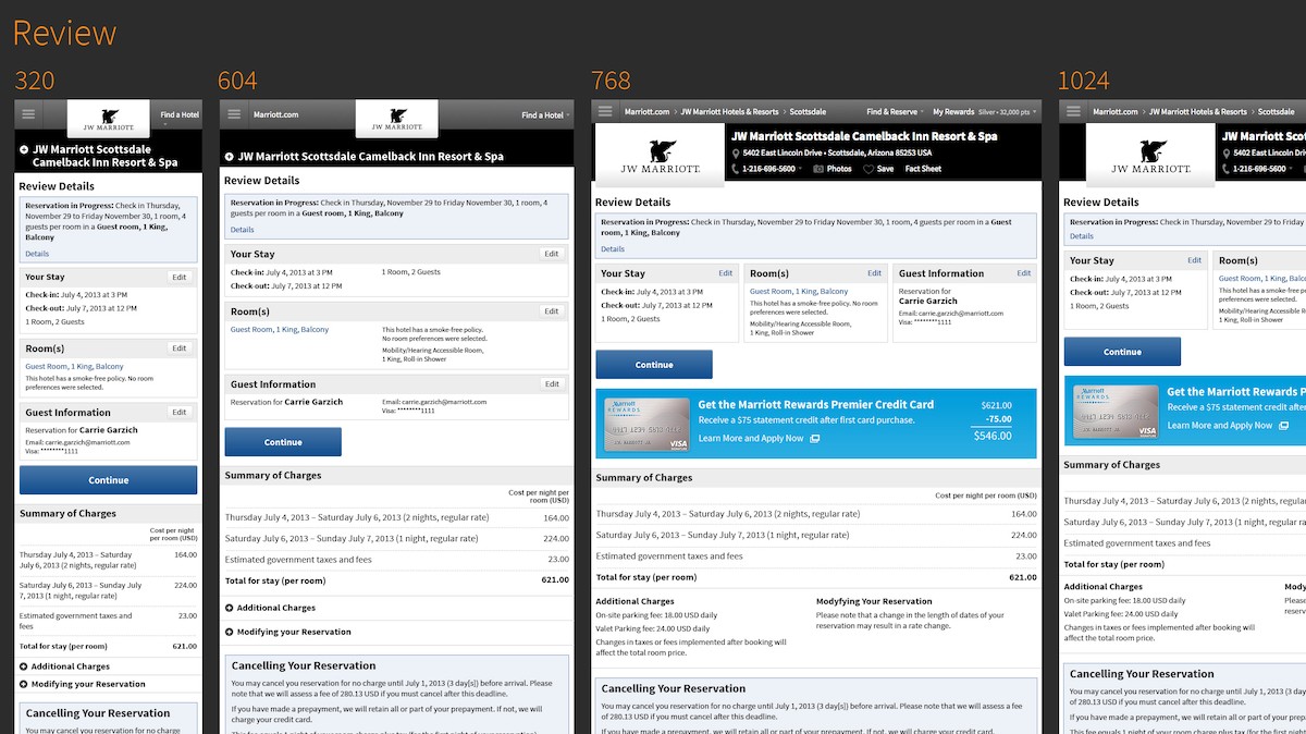
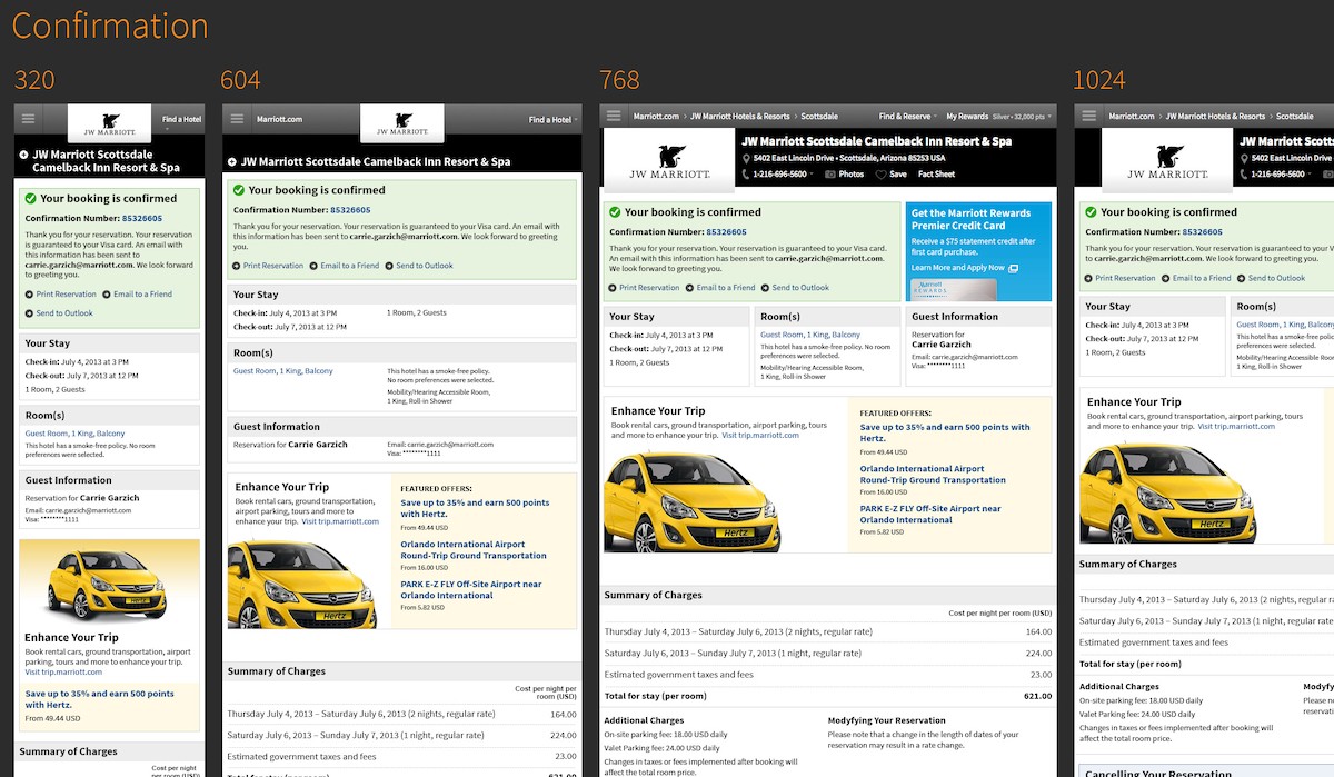
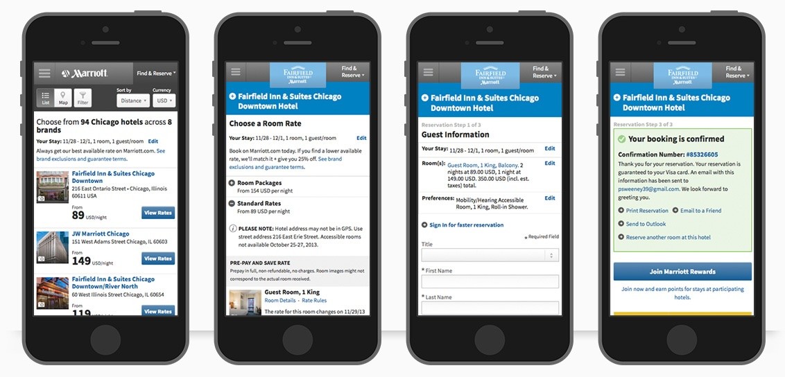
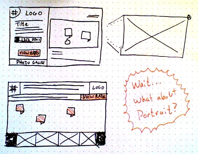
Screen sketches, before Photoshop → Confirmation screen, across breakpoints → Review screen, across breakpoints → The same flow, live on Fairfield Inn & Suites.
Learned systematic thinking on Cisco's icon library
EightShapes had an ongoing relationship with Cisco, and designers rotated across projects regularly. I worked on their WebEx sign-in UI, along with a separate engagement: a UI kit with loading screens in four color themes and a full iOS app icon system. The key piece was an icon matrix; every icon mapped across five contexts (Tab Bar, Navigation Bar, Toolbar, Table View, Other), each marked iOS Standard or Cisco-specific, active or inactive. That matrix is the direct ancestor of the DEX icon index I built years later with the same instinct to organize by context and behavior, just applied to an entire organization's icons instead of one app's.

2013. Organized by context and behavior, not by name — the same logic GE Vernova's DEX design system runs on today.
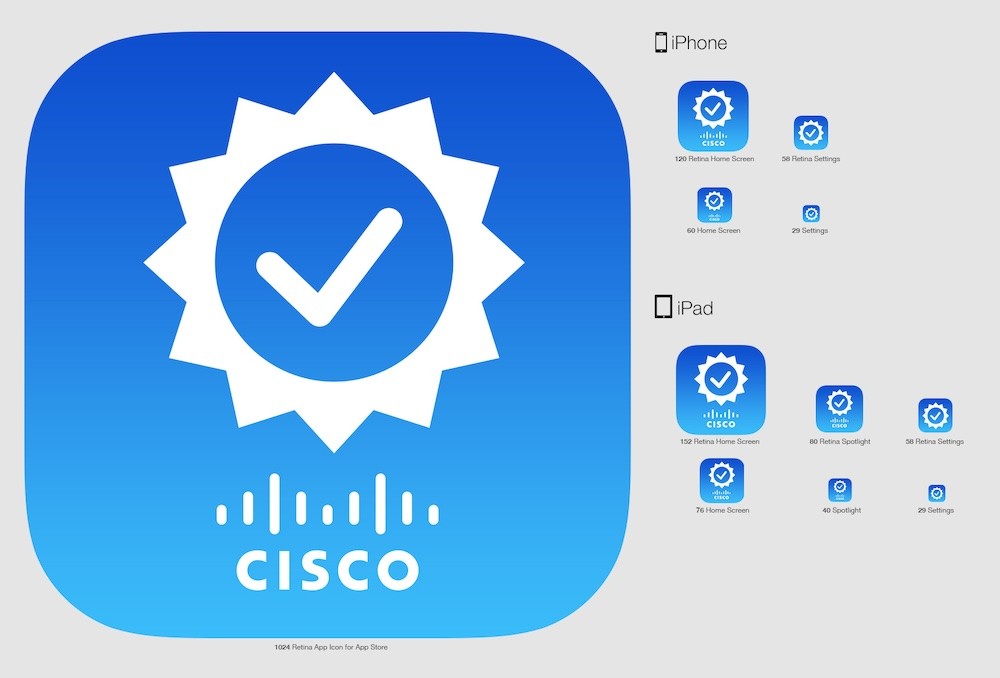

App icon template / Theme-independent elements.
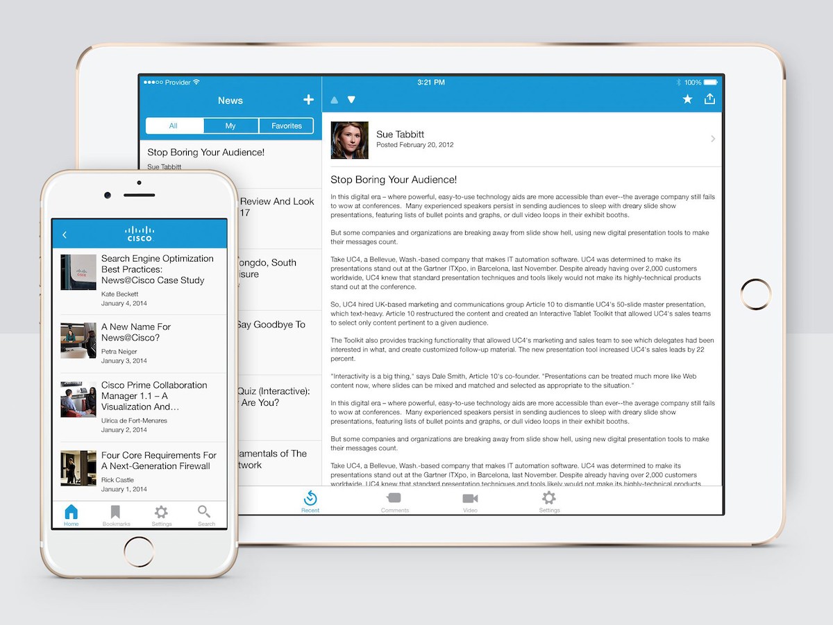
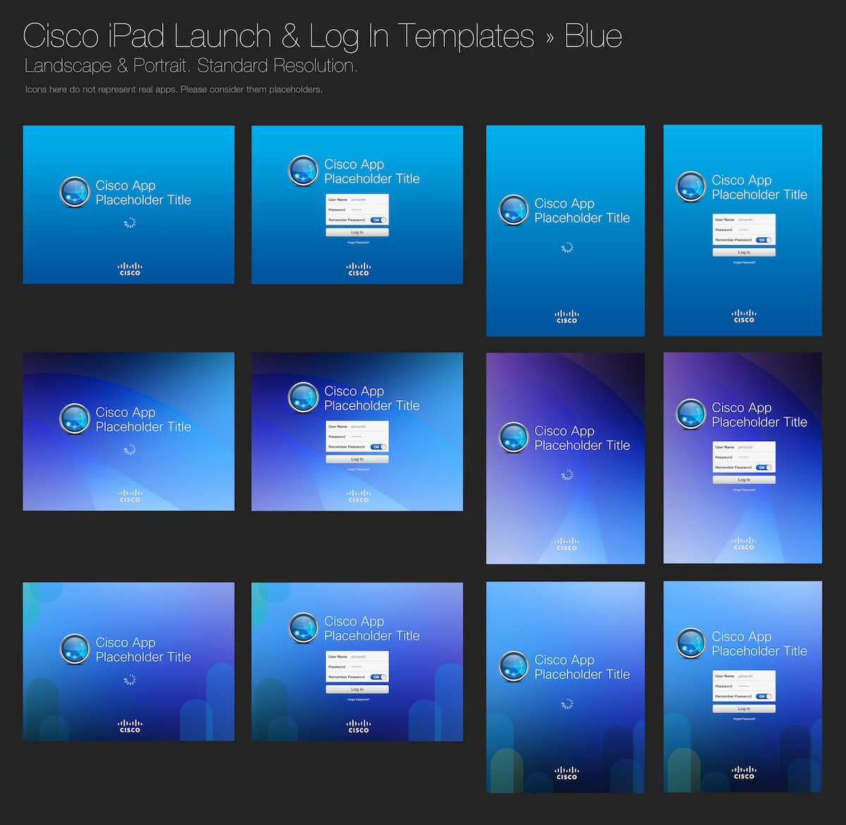
News app, iPhone and iPad / iPad launch and log-in — blue theme, 12 screens. Also available in gray, green and orange.
Learned to build trust on Sonatype's Style Tiles
Sonatype needed a visual language built from scratch. It started with a workshop where I listened for the words stakeholders used to describe how the product should feel.

Sketching the at-a-glance dashboard, before it became a real screen.
The key insight: Sonatype's app delivered constant bad news, security alerts, but the tone still had to feel calm and professional. I used Samantha Warren's Style Tiles method to build four visual directions before we picked one.


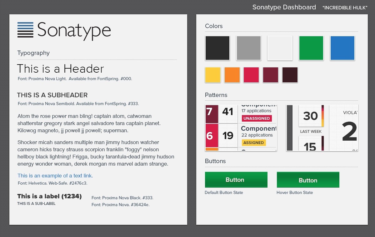
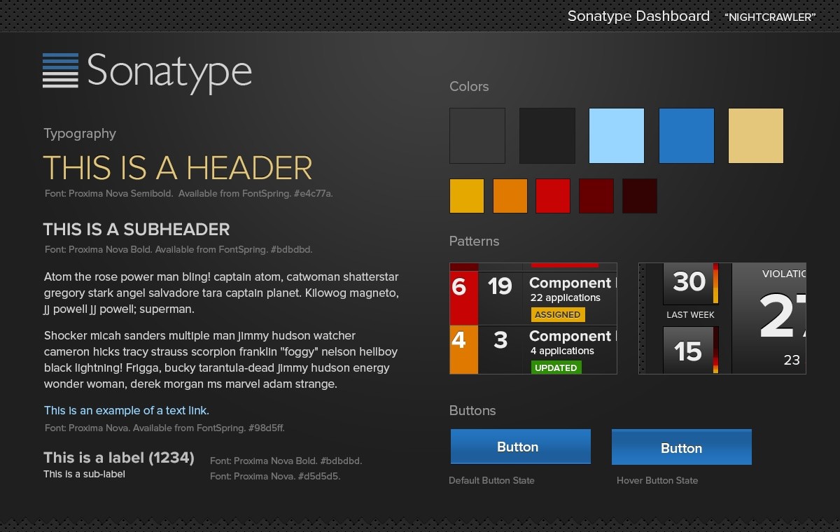
Light, warm accents → Bold greens, white ground → Rounded, blue-forward — shipped → Dark theme — the near-miss.
Dan Brown suggested I throw in a direction nobody asked for, just to see how the client would react to something unexpected — a dark theme, code-named Nightcrawler. It almost won. Stakeholders were drawn to it, but backed off over concerns about eye fatigue from a dark UI. That's a fair concern and one we had no real way to solve at the time – design tokens for safe theme switching didn't exist yet. Mr. Fantastic, a lighter, rounded direction, shipped instead.

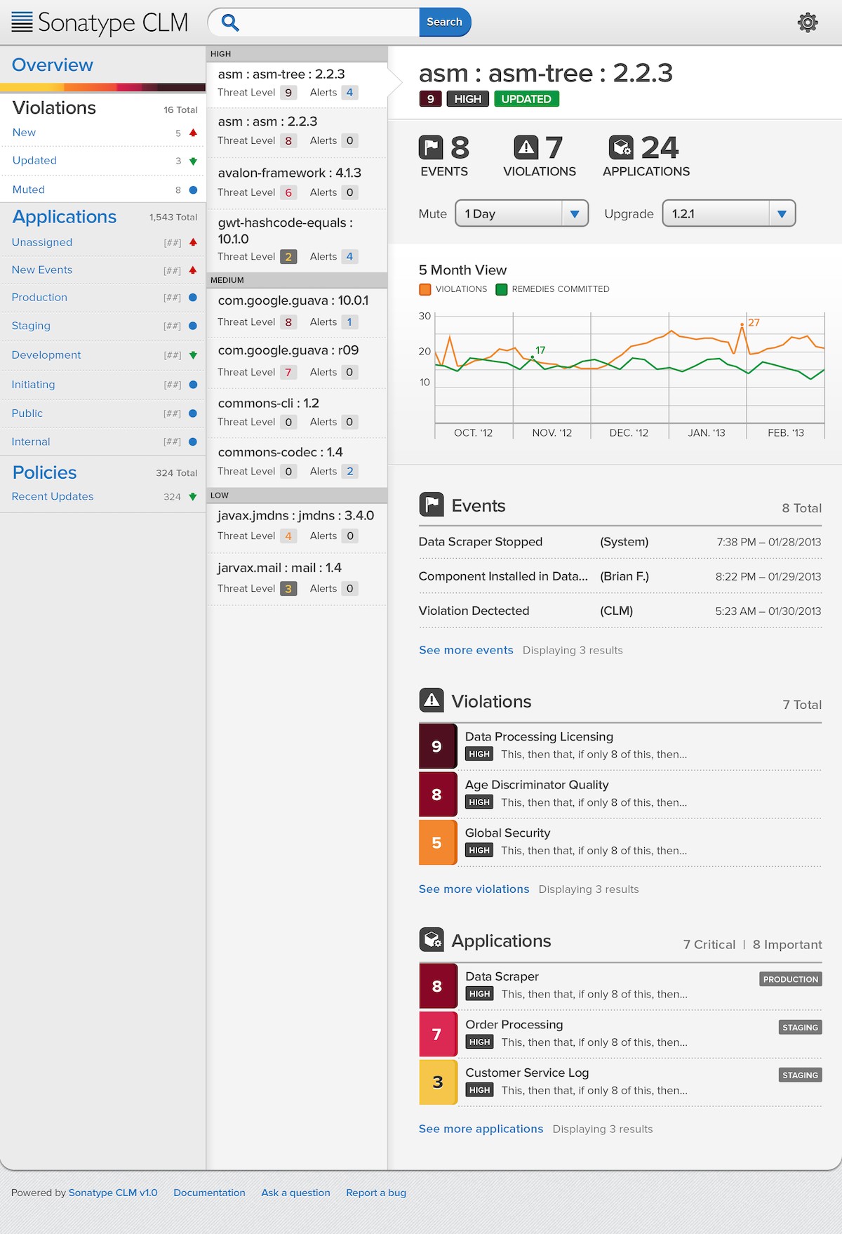
Light, warm accents → Bold greens, white ground → Rounded, blue-forward — shipped → Dark theme — the near-miss.


Light, warm accents → Bold greens, white ground → Rounded, blue-forward — shipped → Dark theme — the near-miss.
I documented the original Style Tiles process in writing at the time. Years later, that exact problem, a dark theme with no system to manage it safely, is what the token architecture I built at GE Vernova was designed to solve. The same "calm despite bad news" instinct showed up again years later at Geisinger, this time for insurance explanations instead of security alerts; not a coincidence, a habit.

Sketching the at-a-glance dashboard, before it became a real screen.
The LEGO principle
Modular design works like building with LEGOs — a 2×4 brick made in 1963 still connects to one made today. That's not an accident. It's a deliberate system philosophy: standardized, interoperable, backward-compatible pieces. Design systems work the same way. A button, a card, a form input — these are the bricks. Built once, to a standard, they snap into any product, any context. The icon matrix I built for Cisco in 2013 is the same brick, in the same socket, as the DEX icon index I built years later. Different materials. Same system thinking. EightShapes taught me the goal was never to design a screen. It's to design the rules that make every future screen faster, better, and more consistent than the last. Everything else is decoration.
The Scope
Dozens of client engagements over about three years at a D.C. design systems consultancy, working directly with Nathan Curtis and Dan Brown before design systems had a name. The three most notable: Marriott's first responsive design system and map pin architecture across nine-plus sub-brands. Cisco's iOS icon matrix and app icon system for WebEx. Sonatype's visual language, built from stakeholder workshops and Style Tiles.
Where It Stands
None of these projects are still running — this was the training ground for what came after. The EightShapes Specs plugin, built by Nathan Curtis, still generates the specs inside the sticker sheet system at GE Vernova today. The Sonatype stencil I built for developers was an early version of the same idea — a systematic reference instead of a finished screen — that became the sticker sheet format itself. The Cisco icon matrix's logic — organize by context and state — is the direct ancestor of the DEX icon index. The "calm despite bad news" instinct from Sonatype became the north star for the Geisinger redesign years later. Define the unit, then the taxonomy — it's still the first move I make on any new system. The projects ended in 2015. The habit didn't.
